-
Bug
-
Resolution: Won't Do
-
 Major
Major
-
None
-
6.1.0
Description of problem:
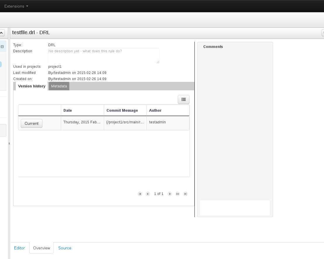
The input element for comments (asset Overview tab) is pretty much indiscernible from the whole comments box - there's only a small difference in color and no border.
On my monitor, it is visible enough if the monitor's top side is bent slightly backwards and my eyes are below the input element. Considering the placement of the element on the page - near the bottom - this is very uncomfortable.
Users shouldn't be subjected to finding the right angle for looking at certain parts of the GUI or tweaking their display settings just so that one element would be visible.
Version-Release number of selected component (if applicable):
6.1 ER5
- is related to
-
RHBPMS-1677 [MetaData - Comments] The comment entry box is hard to find.
-
- Closed
-
- relates to
-
-
- Closed
-

