Details
-
Bug
-
Resolution: Done
-
 Major
Major
-
None
-
None
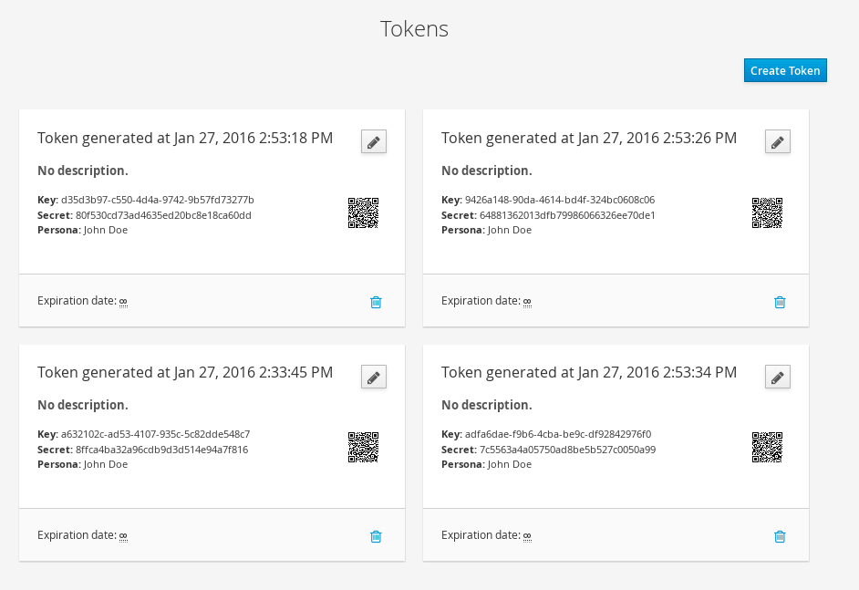
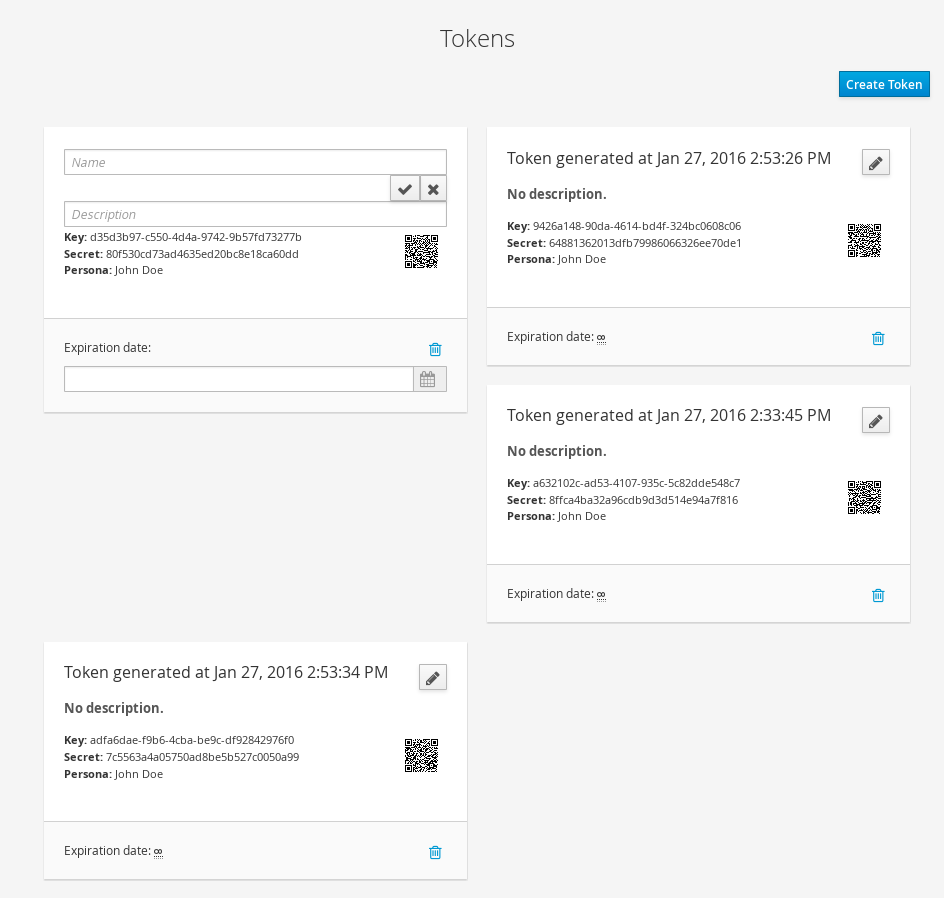
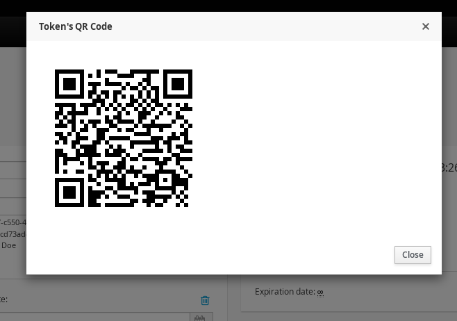
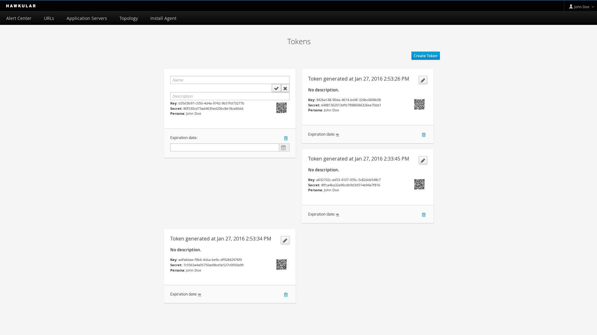
Description
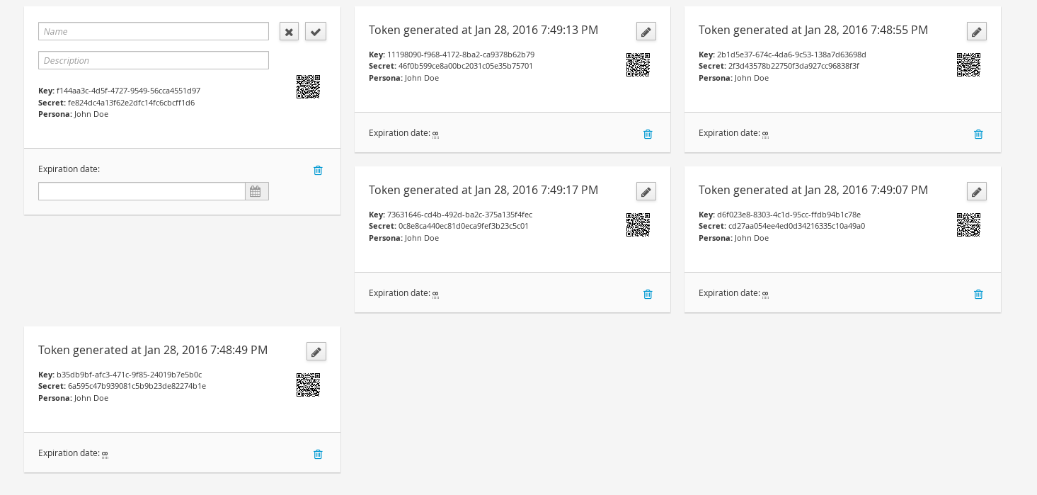
The Tokens UI has been refactored, but I couldn't get all the details right. Notably:
- When in "Edit" mode, the fields are too big. I think it should be smaller, specially the "Name" field, so that the "confirm"/"cancel" buttons stay on the same line
- Also in Edit mode, the card gets a bit bigger, causing the screen to look ugly when there are, say, more than 4 tokens.
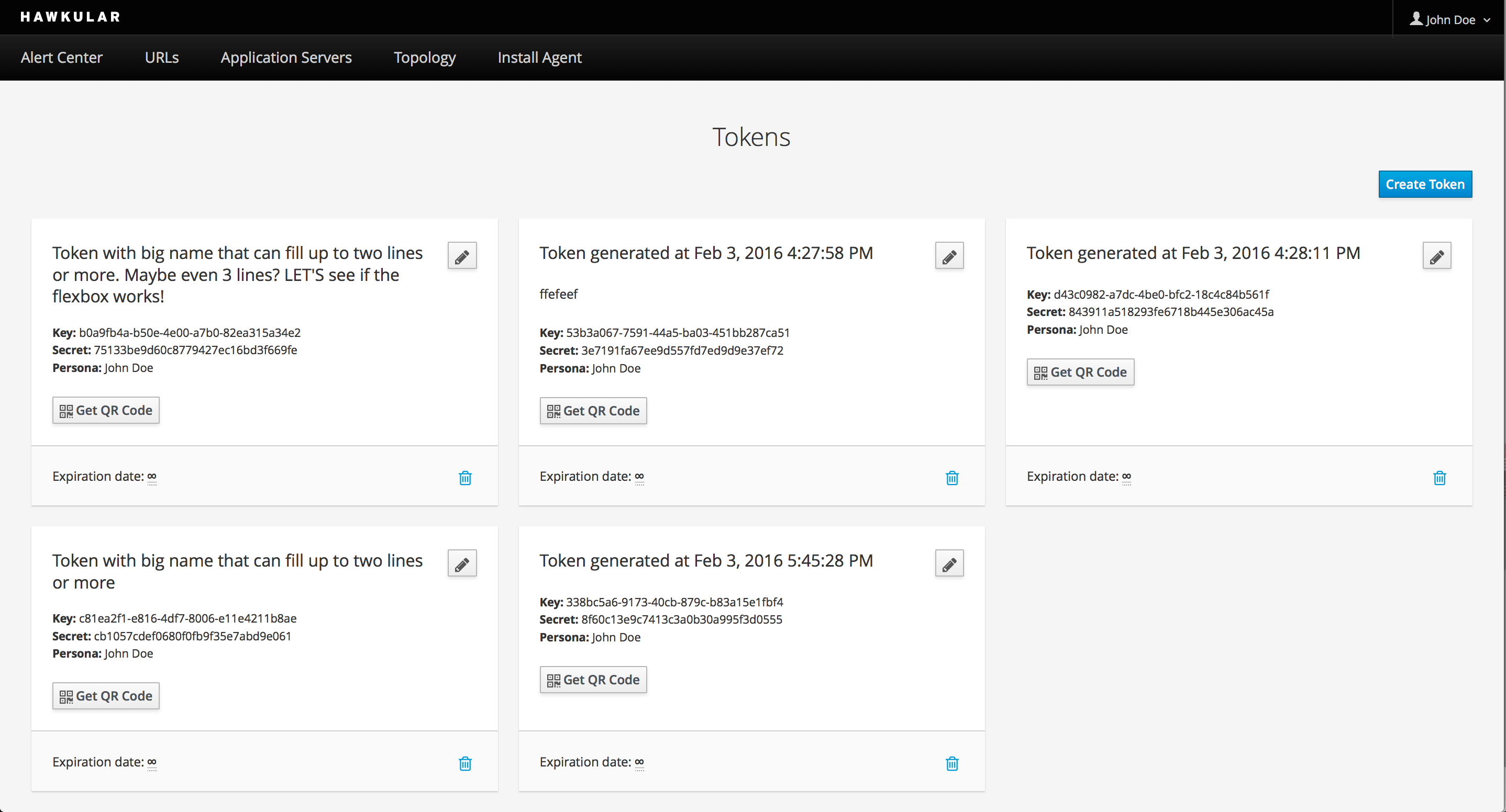
- I think it fits far more tokens on a row than just two. But I couldn't find an easy way to increase the canvas size for it.
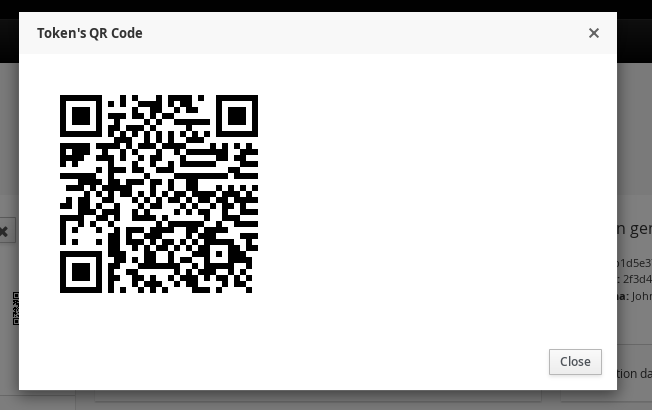
- On the QR Code modal, I believe the QR Code should be centered.
- Other things that I might have missed