-
Task
-
Resolution: Done
-
 Major
Major
-
None
-
None
-
NEW
-
NEW
kkufova bdellasc
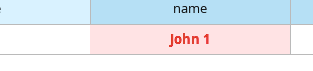
I noticed that the error text is a little "fuzzy" looking, the edges aren't very sharp and I was concerned that it might not be legible. I asked Danielle about the specs for it and it's the same size just bolded.
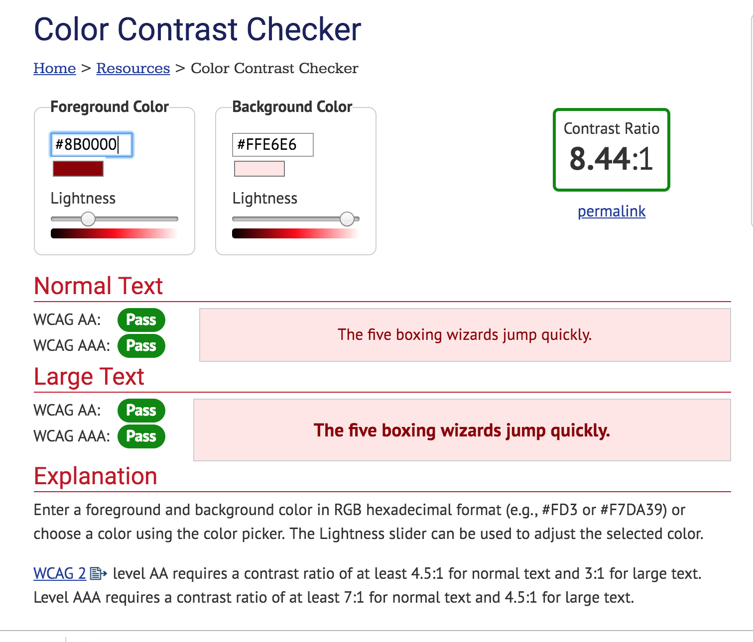
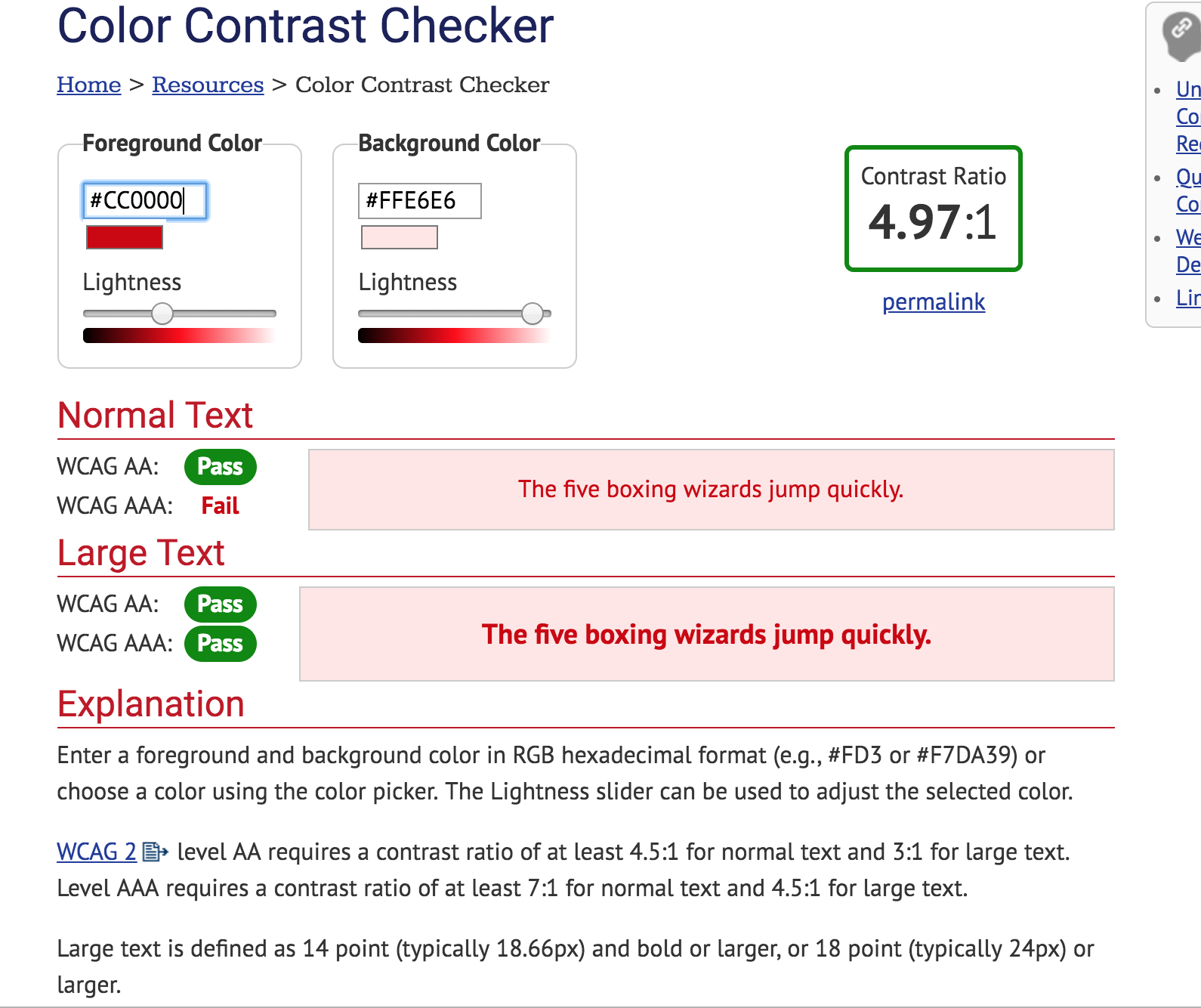
I did an online accessibility text using the following tool, with our current hex values: https://webaim.org/resources/contrastchecker/. It failed for level 3 compliance, but I'm not sure we need to shoot for that or not? I tried the darker PatternFly red color "#8b0000" and it passed at all levels, even at smaller sizes.
I'm wondering if we could use the darker red, in the non-bolded font? And if so, perhaps the text would be a little bit more legible.
Just wanted to ask about this, please let me know what you think.