Description
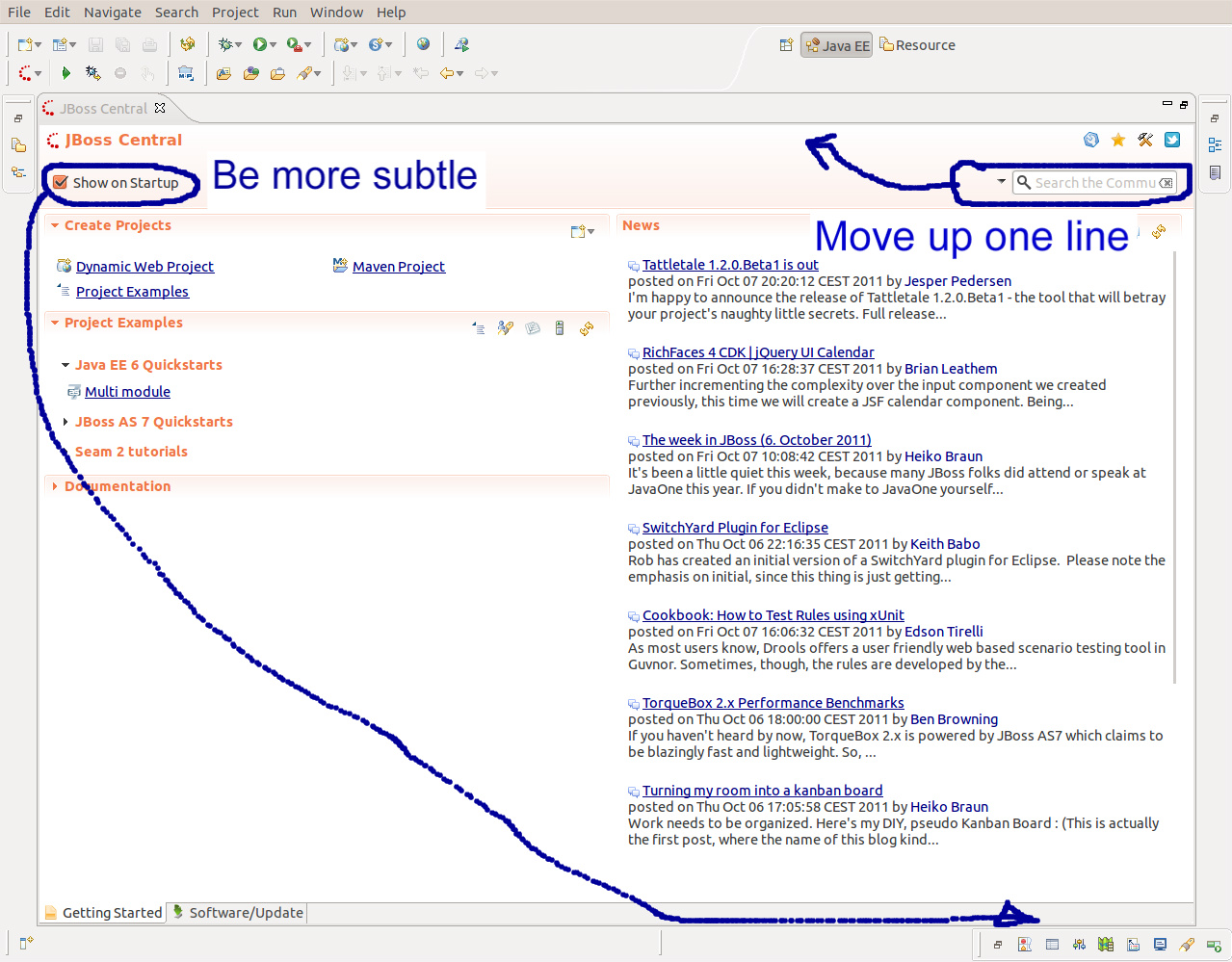
I think we loose some screen real estate with the search bar in the dashboard. We could put it one line above.
Similarly, the "show on startup" checkbox should be more subtle, not "in your face" all the time. Why not put it at the bottom right?