-
Bug
-
Resolution: Done
-
 Major
Major
-
9.1.0.CR1
-
devex #119 August 2016
-
8
-
NEW
-
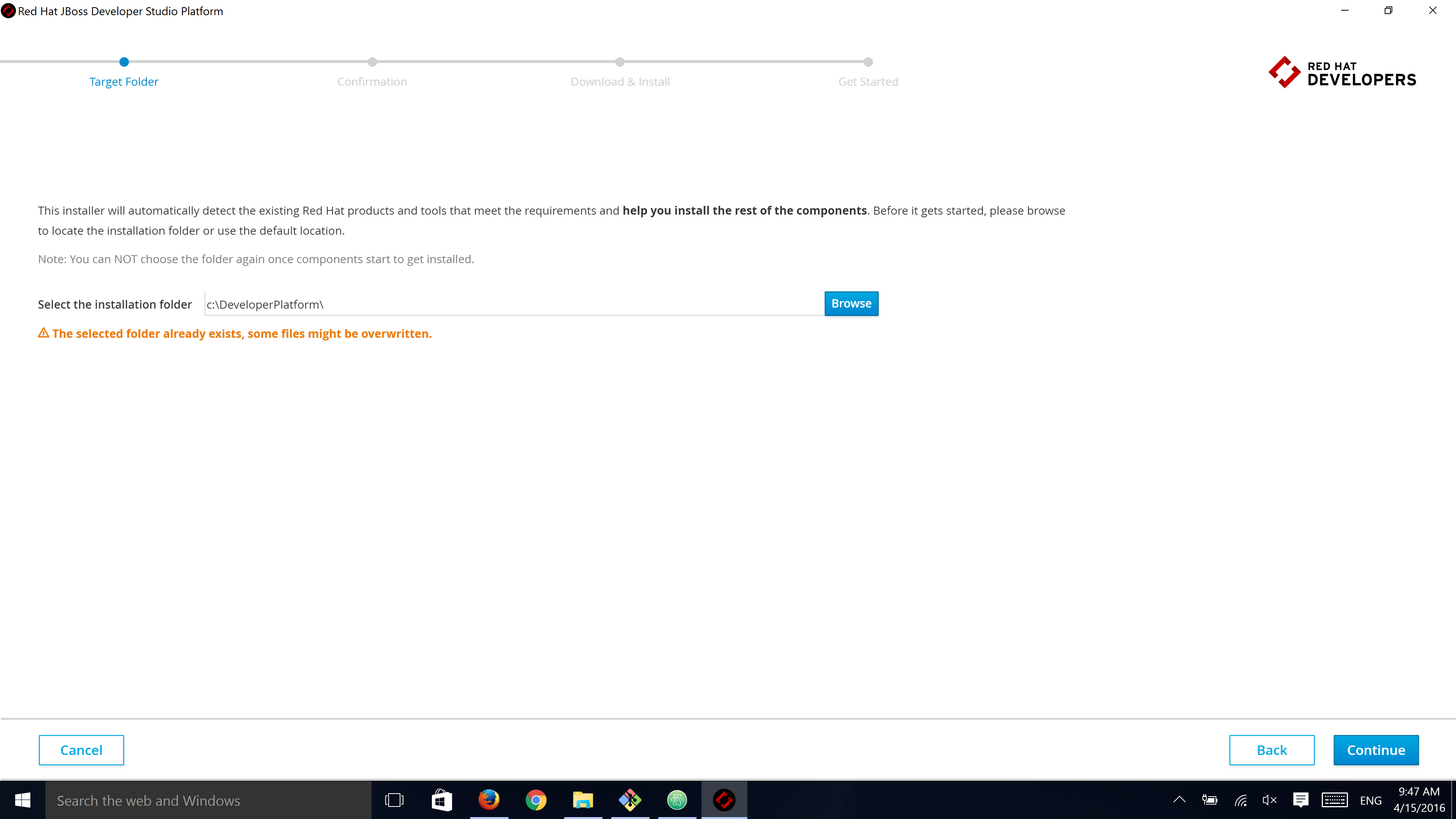
There are a few visual issues with the target folder input group that make it look really weird:
- When not focused, there is no real border around the input box, just a little line on the bottom
- The Browse button is shoved right on top of the input field - when the field is focused, its border is hidden under the button on the right
- The input field should probably be auto-focused
- When the validation message shows an error, it has a red icon with black text
- The path with spaces warning has black text - plus since this path is not allowed, it should show as error, not a warning
- The message that folder will be created looks exactly like a warning, it should be styled as info (no orange text and icon)