Details
-
Documentation
-
Resolution: Done
-
 Minor
Minor
-
None
-
None
-
None
Description
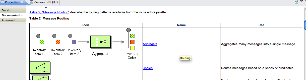
See attached screenshot.
There is table of all the EIPs and 1st column has the EIP icon. The aggregator is too big. It should not have the 3 input messages and 1 output message. eg it should only be that single green icon.
Also the EIPs which has no special icon (they use that grey icon). Maybe we should upsize it a bit so it looks in similar height/weight as the other icons. Then it looks better.